
useScreenSafeArea
Reactive env(safe-area-inset-*)
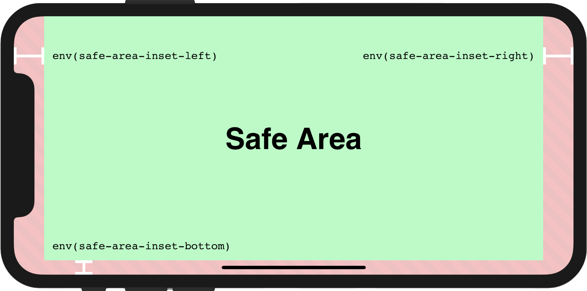
Demo
top:
right:
bottom:
left:
Usage
In order to make the page to be fully rendered in the screen, the additional attribute viewport-fit=cover within viewport meta tag must be set firstly, the viewport meta tag may look like this:
html
<meta name="viewport" content="initial-scale=1, viewport-fit=cover" />Then we could use useScreenSafeArea in the component as shown below:
ts
import { useScreenSafeArea } from '@vueuse/core'

const {
  top,
  right,
  bottom,
  left,
} = useScreenSafeArea()
For further details, you may refer to this documentation: Designing Websites for iPhone X
Component Usage
This function also provides a renderless component version via the
@vueuse/componentspackage. Learn more about the usage.
vue
<template>
  <UseScreenSafeArea top right bottom left>
    content
  </UseScreenSafeArea>
</template>
Type Declarations
ts
export interface UseScreenSafeAreaReturn {
  top: ShallowRef<string>
  right: ShallowRef<string>
  bottom: ShallowRef<string>
  left: ShallowRef<string>
  update: () => void
}
/**
 * Reactive `env(safe-area-inset-*)`
 *
 * @see https://vueuse.org/useScreenSafeArea
 */
export declare function useScreenSafeArea(): UseScreenSafeAreaReturn
Source
Contributors
 Anthony Fu
 Anthony Fu
 Vida Xie
 IlyaL
IlyaL Melkumyants Danila
 Fernando Fernández
 vaakian X
 Ayaka Rizumu
 Jelf
Jelf